Mono
Mono asked for a brand that could make a budgeting app feel like a power tool instead of a guilt trip — and a marketing site sharp enough to carry it. We rebuilt both from the typography up.
Client
Mono Money, Inc.
Role
Brand, design & build
Services
Identity · Web design · Development
Year
2026
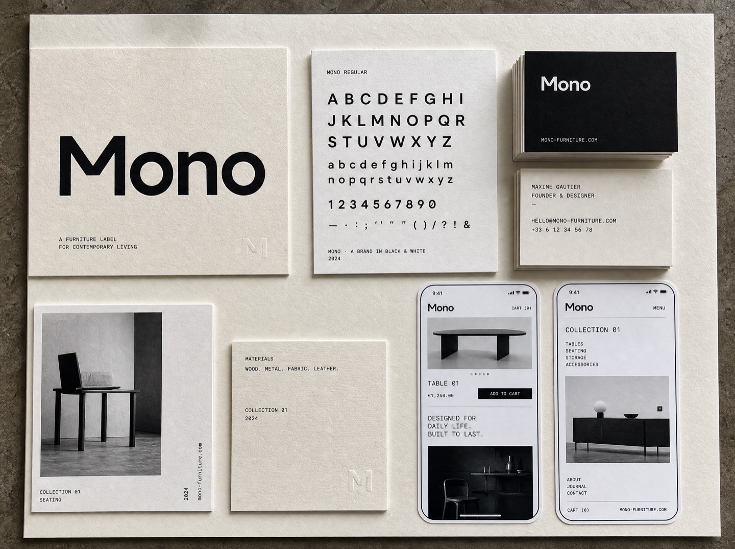
Budgeting apps all make the same promise and the same mistake: they talk to you like a disappointed parent. Mono's founders wanted the opposite — a tool that treats a budget like an instrument you play, not a diet you fail.
The problem
The product was genuinely different: local-first, no bank logins sold to anyone, one honest price. But the old site said none of that. It looked like every other fintech landing page — soft gradients, floating phones, borrowed trust. Conversion sat under one percent and nobody could explain what made Mono worth paying for in one sentence.
We started with that sentence. Three workshops later the whole brand hung off five words: your money, none of ours.
What we made
- A wordmark cut from a modified grotesque — heavy, boxy, unmistakably not-a-bank.
- A type-first design system: ink on cream, hard rules, one loud green reserved for numbers going the right way.
- A marketing site rebuilt around the pricing page — the page people actually decide on — with a live, playable demo of the budget board.
Chronicle gave us a brand that sounds like us on our best day. The site finally says the thing we could never fit in a tagline.Dana Okafor — Cofounder, Mono
What happened
Trial signups tripled in the first six weeks. More telling: support stopped getting the question so what does Mono actually do? The sentence was doing its job.
Want results like these?
Start a project